Metrics in Explore
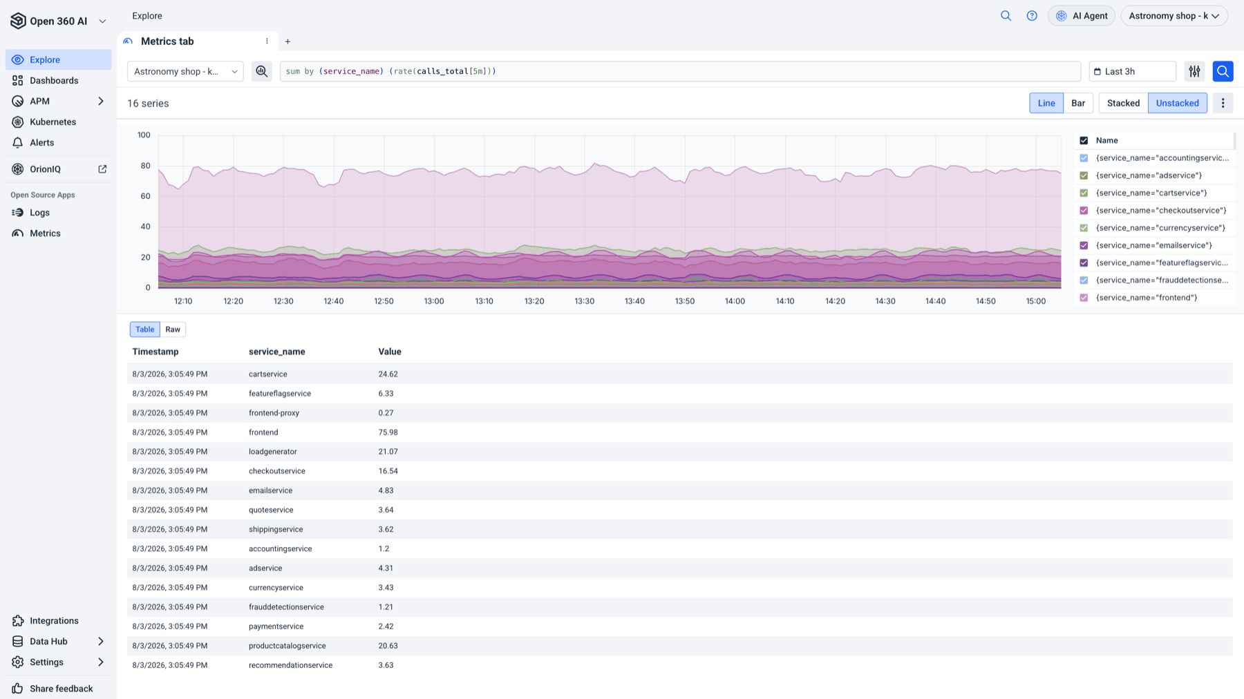
The Metrics tab in Explore is where you query metrics ad hoc. Write PromQL straight into the editor when you know what you want, or build the query from your actual data using the Metrics Browser when you don't. Either way you land on a chart and a table you can then send to a dashboard, turn into an alert, or export.
Prerequisites
At least one metrics account. The Metrics tab is disabled with the tooltip No metrics accounts available for this account when none exist. See Send your metrics if you haven't shipped metrics yet.
Query your metrics
Select the Metrics tab in Explore. The default timeframe is the last hour.
Write PromQL directly
Type a PromQL expression into the editor and run it:
sum by (service) (rate(http_requests_total[5m]))
The editor supports Logz.io's built-in variables, so you can write a query that adapts to the selected timeframe rather than hard-coding a window:
| Variable | Resolves to |
|---|---|
$__interval | A step sized to the current timeframe and chart width |
$__rate_interval | A window safe for rate() at the current step |
$__range | The full selected timeframe |
Build a query with the Metrics Browser
Select the Metrics Browser to construct a query from what's actually in your account, without knowing the metric names up front.
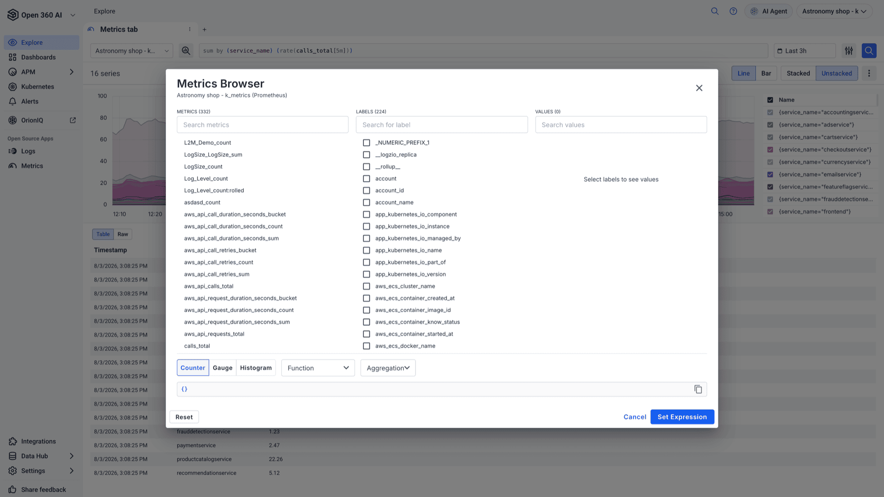
Work left to right: pick a metric, then narrow by label and value. Each column shows how much there is to choose from — a busy account might offer several hundred metrics and a couple of hundred labels — and values only load once you've selected a label. A query preview updates as you go, so you can see the PromQL the browser is writing and learn the syntax from it.
When the preview looks right, select Set Expression to send it to the editor, where you can keep editing it by hand.
The builder strip adapts to the kind of metric you're working with:
Counter — for values that only increase. Choose a function, and a window for the range functions:
rate() · irate() · increase() · avg_over_time() · sum_over_time() · min_over_time() · max_over_time() · last_over_time()
Window presets are $__interval, $__rate_interval, $__range, 1m, 5m, 15m, 30m and 1h, defaulting to 5m.
Gauge — for values that rise and fall. No function needed; go straight to aggregation.
Histogram — for bucketed distributions. Set a quantile instead of an aggregation; presets are 0.5, 0.9, 0.95 and 0.99, defaulting to 0.95.
For Counter and Gauge you can then aggregate with sum, avg, min, max, count, stddev, topk or bottomk, and group the result by one or more labels. Choosing topk or bottomk reveals a K input, which defaults to 5.
Shape the visualization

- Line or Bar.
- Stacked or Unstacked.
- Step (min) — the minimum resolution between data points, in minutes. Leave it on
autoto let the timeframe decide, or set an explicit step when you want a consistent resolution across comparisons. A larger step means fewer, coarser points. - Legend — a template for series names, defaulting to
{{label}}. Use it to build readable names out of label values instead of reading raw series selectors.
The number of series returned is shown alongside these controls, which is the quickest way to notice a query has fanned out far wider than you intended.
Below the chart, the results table has two views: table for parsed rows, and raw for the unformatted response when you need to see exactly what came back.
Act on the result
The actions menu turns a query you like into something durable:
- Add to dashboard — puts the current query on a new or existing Unified Dashboard as a panel.
- Create alert — pre-fills a metrics alert from the current PromQL, so the thing you just proved by hand starts watching itself. See Alerts.
- Export graph to CSV and Export table to CSV.
Drill from metrics to logs
A metric tells you that something changed; the logs tell you why. Select a point on the chart to open the drilldown panel and jump to the logs for that moment and those label values, carrying the timeframe with you.
This is the fastest path from a spike on a dashboard to the log line that explains it, and it's the main reason to start an investigation in Explore rather than in a static dashboard.
Related
- Intro to Explore — the other Explore modes
- PromQL query basics
- Dashboards