Panel Types
A Unified Dashboard panel pairs a query with a visualization. This page lists the visualizations available and what each is good for.
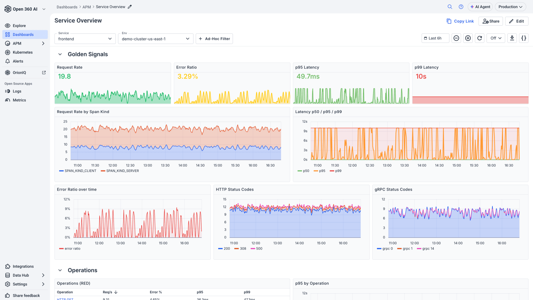
Most useful dashboards mix panel types: single values for the headline numbers, time series for the shape, and a table for the detail.
Every panel can query metrics (Prometheus / PromQL) or logs (OpenSearch / Lucene) — see Dashboards Configuration Guide for how to write the queries themselves.
Time series and trends
| Panel | Use it for |
|---|---|
| Time Series Chart | The default. One or more series over time, as lines or filled areas. Anything where the shape over time is the point. |
| Bar Chart | Comparing discrete categories rather than a continuous trend — errors by service, requests by endpoint. |
| Histogram Chart | The distribution of a bucketed metric, such as request duration buckets. |
| Heatmap Chart | Density across two dimensions — useful when a line chart averages away the thing you're looking for. |
| Status History Chart | State over time as a timeline: up/down, healthy/degraded, one row per entity. |
Single values
| Panel | Use it for |
|---|---|
| Stat Chart | One number, optionally with a sparkline. The panel for "what is it right now". |
| Gauge Chart | One value against a range, with thresholds. Good for utilisation and capacity. |
| Bar Gauge Chart | Several values as horizontal bars against a shared scale — a compact leaderboard, such as top pods by memory. |
| Pie Chart | Proportions of a whole. Best kept to a handful of slices. |
Tables and text
| Panel | Use it for |
|---|---|
| Table | Tabular query results with configurable columns. |
| Time Series Table | Series listed as rows rather than drawn — handy when you want current values for many series without a crowded chart. |
| Logs Table | Actual log entries on the dashboard, from a Lucene query. Puts the evidence next to the metric that raised the question. |
| Markdown | Static text: what the dashboard is for, links to runbooks, what to do when a panel goes red. |
| Alert List | Alerts and their state, so a dashboard can show what's currently firing alongside the data. |
Computed panels
Math — builds a panel from an expression over other queries, rather than a single query. Use it for ratios and derived values, such as an error rate expressed as failures over total.
Choosing a panel
A few rules of thumb that save rework:
- If you want to know when something changed, use a time series. If you want to know how much right now, use a Stat or Gauge.
- Reach for Bar Gauge over Pie when you have more than five categories — the bars stay readable and comparable.
- Prefer a Logs Table over a link out when the log line is the answer. Prefer a link out when the reader will need to search around it.
- A Markdown panel at the top of a dashboard is usually worth the space it takes. The person reading the dashboard at 3am is rarely the person who built it.
Related
- Dashboards Configuration Guide — creating panels, queries and variables
- Ad Hoc Filters — filtering a whole dashboard without editing panels
- Drilldowns — clicking through from a panel to logs, traces or another dashboard