Compare Spans
Knowing which spans are slow is the easy half. Compare Spans answers the harder half: what those spans have in common that the healthy ones don't.
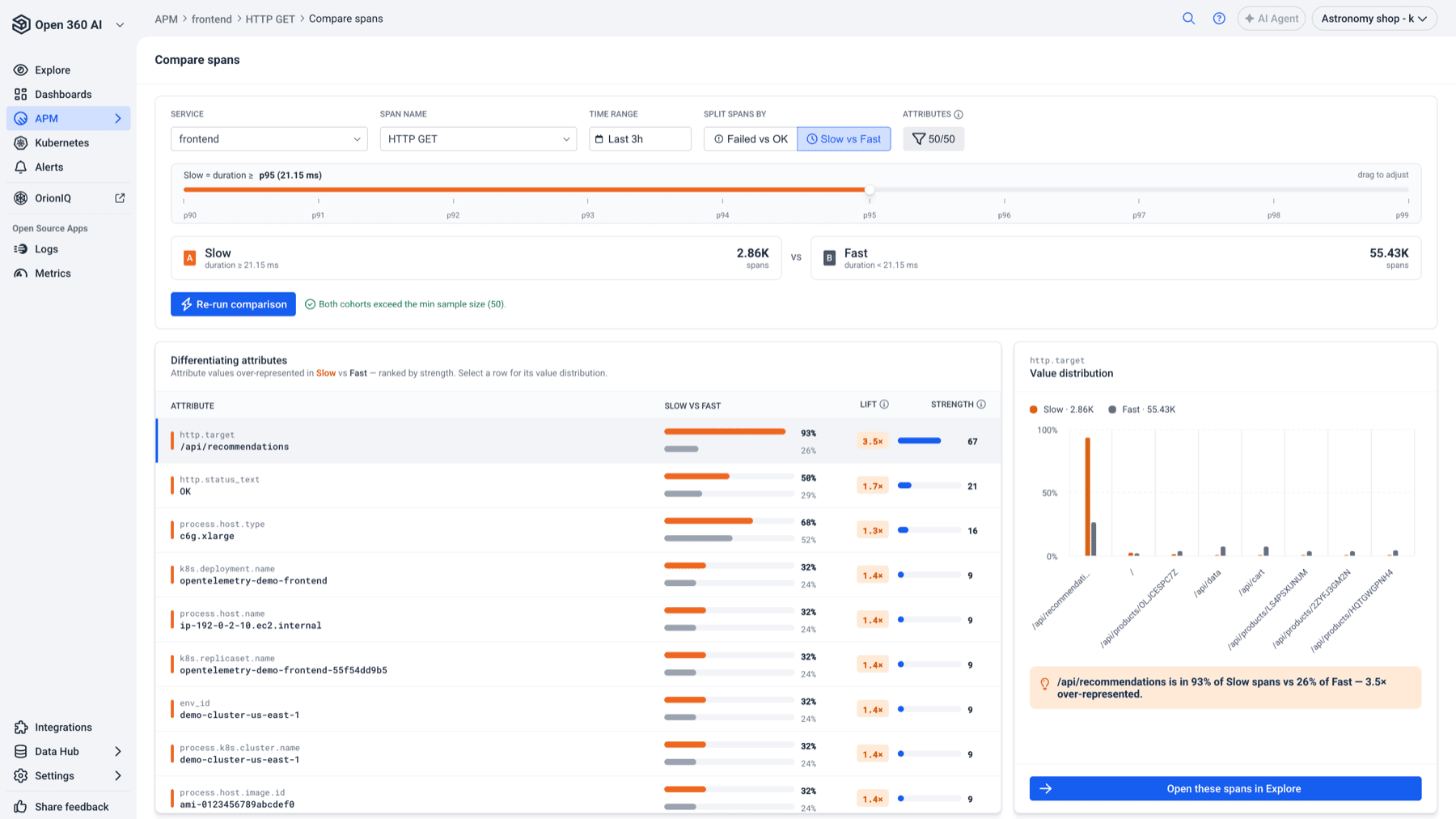
It takes one operation, splits its spans into two cohorts - failed versus OK, or slow versus fast - and ranks every span attribute by how much it separates the two. Instead of eyeballing traces one at a time looking for a pattern, you get the pattern.
When to use it
- A p99 got worse and you don't know which dependency, host, or region owns the regression.
- An operation fails intermittently and you want the attribute the failures share.
- You suspect one bad pod, one AZ, or one client version, and you want that confirmed or ruled out before you dig into individual traces.
Prerequisites
- A tracing account with spans in the selected time range.
- APM → Compare Spans in the navigation. If you don't see it, the feature isn't enabled for your account yet - contact Logz.io support.
Set the scope
Everything above the report defines what gets compared. Nothing runs until you select Run comparison.

| Control | What it does |
|---|---|
| Service | The service whose spans you're comparing. Changing it clears the span name. |
| Span name | The specific operation to compare. Required - a comparison needs one operation, or the cohorts aren't like-for-like. |
| Time range | Quick or absolute range. Both cohorts are drawn from this window. |
| Split spans by | Failed vs OK or Slow vs Fast. |
| Attributes | Which span attributes are eligible for the comparison. Uncheck noisy ones to keep them out of the ranking. |
The service and span-name pickers load on open and stay cached for 15 minutes, since the aggregation behind them scans spans server-side.
Choose a split
Failed vs OK splits on span status: cohort A is status = error, cohort B is status = ok.
Slow vs Fast splits on duration at a percentile you choose. A slider appears with the threshold:

Drag anywhere from p90 to p99 - the default is p95. The resolved threshold is shown next to the percentile as a real duration (for example, Slow = duration ≥ p95 (1.2s)), so you can see what you actually selected. Cohort A becomes duration ≥ threshold, cohort B duration < threshold.
The threshold is computed from the data, so it re-resolves whenever you change the scope. Excluding attributes is the one change that keeps the existing threshold, since it doesn't change which spans are in which cohort.
Check the cohorts
Two cards show the resulting cohorts and their span counts, A versus B, before and after each run. A dash means the comparison hasn't run yet.
Next to the run button, a signal-quality note tells you whether the result is trustworthy:
- Weak signal - fewer than 50 spans in a cohort. The comparison still runs, but small cohorts produce coincidences that look like causes. Widen the time range.
- Confirmation that both cohorts clear the 50-span minimum.
Read the report
The Differentiating attributes table lists attribute values that are over-represented in cohort A, ranked by strength.
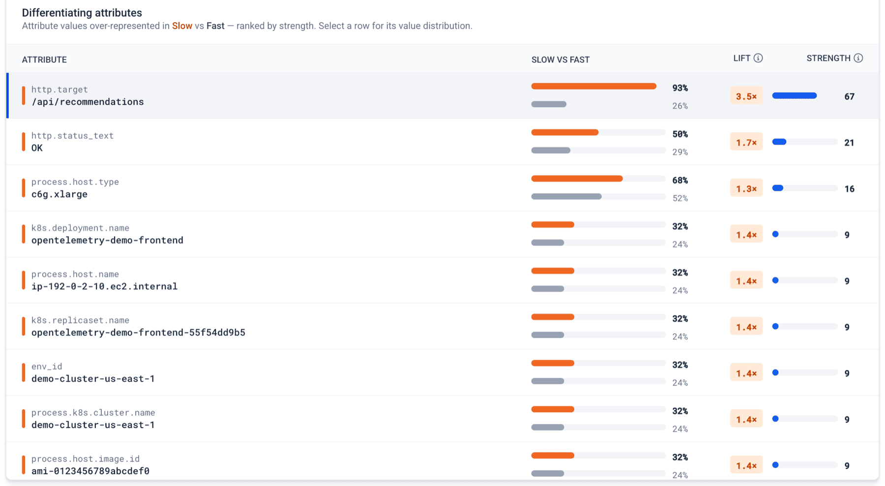
Each row is one attribute value - not just the attribute - and shows:
| Column | Meaning |
|---|---|
| Attribute | The attribute name and the value, for example k8s.pod.name / checkout-7f9c-x2h4. |
| Failed vs OK (or Slow vs Fast) | Prevalence in each cohort as paired bars and percentages: what share of cohort A carries this value, versus cohort B. |
| Lift | How many times more prevalent the value is in A than in B. 3× means three times as common. |
| Strength | The prevalence gap on a 0-100 scale. Higher means more distinctive to cohort A. This is the sort order. |
Two kinds of row are de-emphasized on purpose:
- Shared values - roughly as common in both cohorts. They show
≈instead of a lift figure and are greyed out. They tell you what's normal, not what's different. - Correlated values - values that split the cohorts identically to a higher-ranked row. They move together with that attribute and add no independent signal, so treat the higher-ranked row as the real lead.
If nothing separates the cohorts, the table says so rather than showing weak rows as if they mattered.
Start at the top row. A high strength and a high lift on something concrete - a pod, a host, an upstream peer, a client version - is your lead.
Inspect one attribute
Select any row to load its Value distribution on the right: the top 8 values for that attribute, side by side across both cohorts.
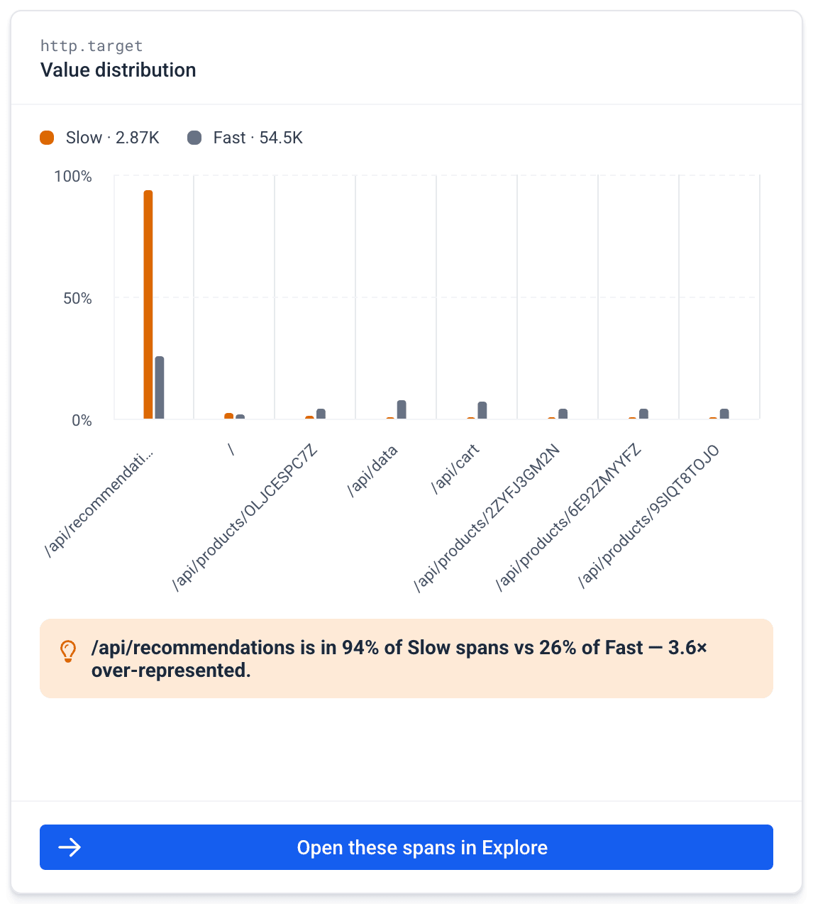
This is the check on the headline. A row can look decisive while the attribute is actually spread across many values, or the concentration can be real - the distribution shows which. Under the chart, a one-line readout restates the finding in plain language, for example us-east-1c is in 71% of Slow spans vs 12% of Fast - 5.9× over-represented.
Drill into the spans
Select Open these spans in Explore to jump to span search filtered to exactly the spans behind that row: the service, the span name, the cohort-A condition, and the attribute value, all ANDed together.
Explore shows a banner back to the comparison. Returning restores the full scope you left - percentile, resolved threshold, and attribute exclusions included - rather than starting a fresh default comparison.
Getting in from a trace
While reading a trace, the span details panel offers a Compare spans action. It carries that span's service and operation straight into a comparison, so you can go from this one span looks slow to here's what all the slow ones share without setting up the scope by hand. See Trace View.
Practical notes
- Compare one operation at a time. Comparing a whole service mixes unrelated work and the top attributes end up describing the mix, not the problem.
- Strength ranks association, not causation. A pod name at the top means the failures concentrate there - it doesn't say why.
- Exclude high-cardinality attributes that are unique per span, like span or trace IDs. They're technically perfectly differentiating and always useless.
- If the result is dominated by attributes you don't care about, uncheck them in Attributes and re-run instead of trying to read past them.