Configuration Guide
Logz.io Dashboards offer a flexible, intuitive way to visualize observability data. Customize layouts, panels, and data sources to create views tailored for monitoring and troubleshooting.
View your dashboards
To access Logz.io Dashboards, click the Dashboards icon in the left-hand navigation.

In the Dashboards Hub, you’ll find all dashboards created by you and your teammates within the account.
All users—except read-only users—can view and create dashboards.
Create a new dashboard
To get started, go to the Dashboards Hub, click Create New, and choose Create Dashboard from the drop down menu.

Choose a folder to nest your dashboard under—or create a new one—and give the dashboard a name.
You’ll be directed to a blank dashboard screen. Click Edit in the top-right corner to begin.
Create a panel group
Before adding panels, create a panel group to organize your content. This step is required to start building the dashboard. Click Save to apply the changes.
Create a panel
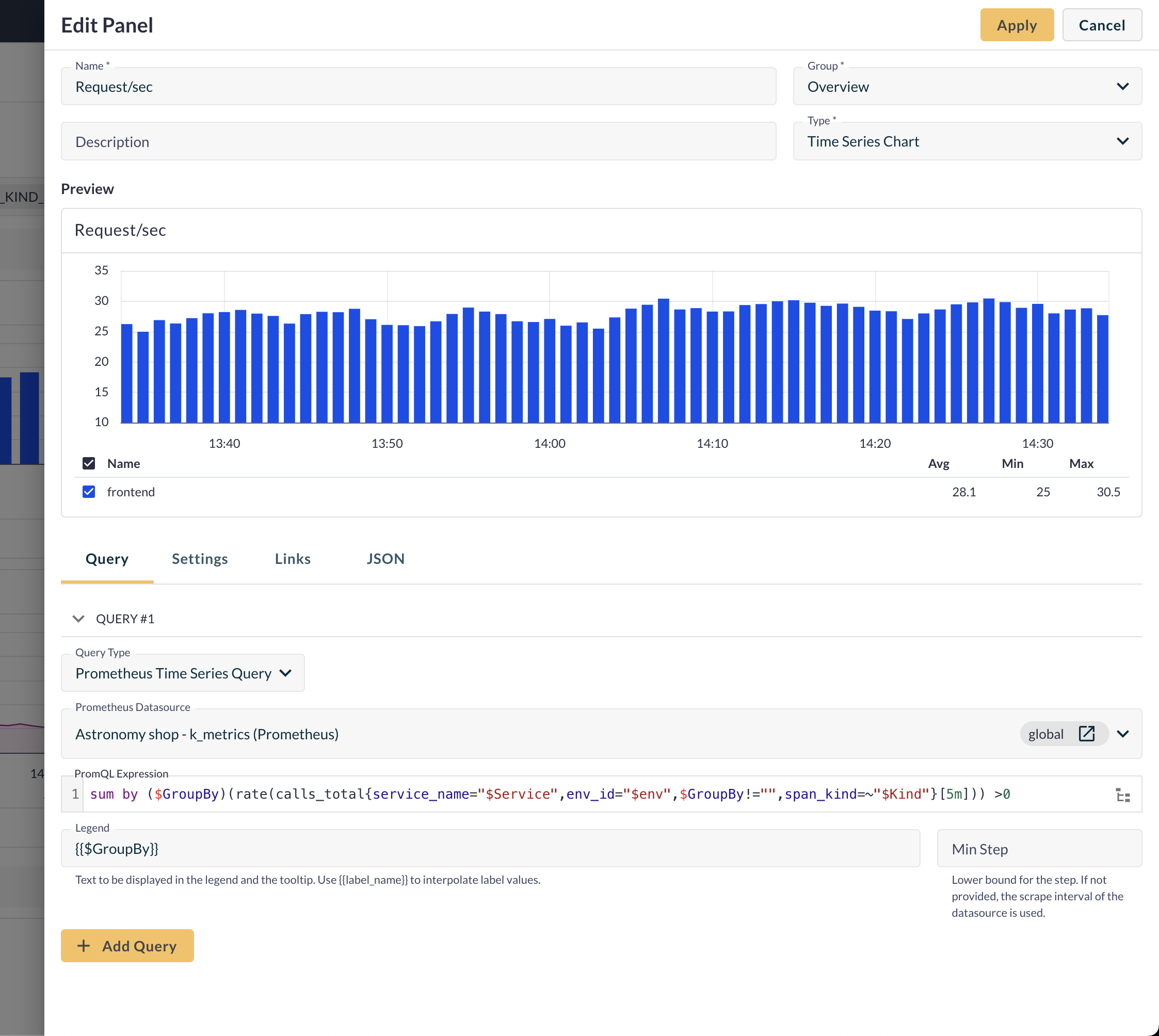
Once you have a panel group, click Edit again and select Panel to begin configuring.
Panel configuration includes:
- Name – Panel title.
- Description (optional) – Context or purpose of the panel.
- Group – Assign to an existing panel group.
- Type – Choose a visualization type (e.g., Time Series Chart, Gauge, Table).
Next, define your data source and query. Select Prometheus Time Series Query for metrics, or Logs Lucene Query for logs. Each query type uses its own compatible data source:
Prometheus Time Series Query
To create metric-based visualizations, select Prometheus Time Series Query as the query type. Then, choose the relevant Prometheus data source based on where your metric data is stored.
In the PromQL Expression field, write your Prometheus query to fetch the time series you want to visualize. The query builder supports full PromQL syntax.
For example, this PromQL query is searching for the rate of calls_total metrics, filtered and grouped dynamically:
sum by ($GroupBy)(rate(calls_total{service_name="$Service",env_id="$env",$GroupBy!="",span_kind=~"$Kind"}[5m])) >0
rate(calls_total[5m]): Calculates the per-second rate of calls_total over the last 5 minutessum by ($GroupBy): Groups the results by a user-selected label (e.g., endpoint, method, etc.)- Filters applied:
service_name="$Service": Filters for a specific serviceenv_id="$env": Filters by environment (like prod/dev)$GroupBy!="": Ignores empty label values in the grouping fieldspan_kind=~"$Kind": Regex filter on span kind (e.g., client, server, or both)
>0: Excludes any groups that have zero traffic
Once you enter your query, a preview of the visualization appears in the preview section.
Use the Legend field to define how the series will appear in the tooltip and chart legend. You can reference Prometheus labels using double curly braces—for example:
{{$GroupBy}}
This will display the value of the label selected in the $GroupBy variable, dynamically.
Use the Min Step field to define the minimum time resolution (in seconds) between data points returned in the visualization.
If left empty, the query will use the scrape interval defined in your Prometheus data source.
Setting a smaller step size can show more granular trends, but may increase query load.
You can add additional PromQL queries to the same panel by clicking Add Query. This helps compare multiple metrics in one visualization.
Once your query is ready, click Add to insert the panel into the selected dashboard group.
Make sure your PromQL expression matches the selected visualization type.
Logs Lucene Query
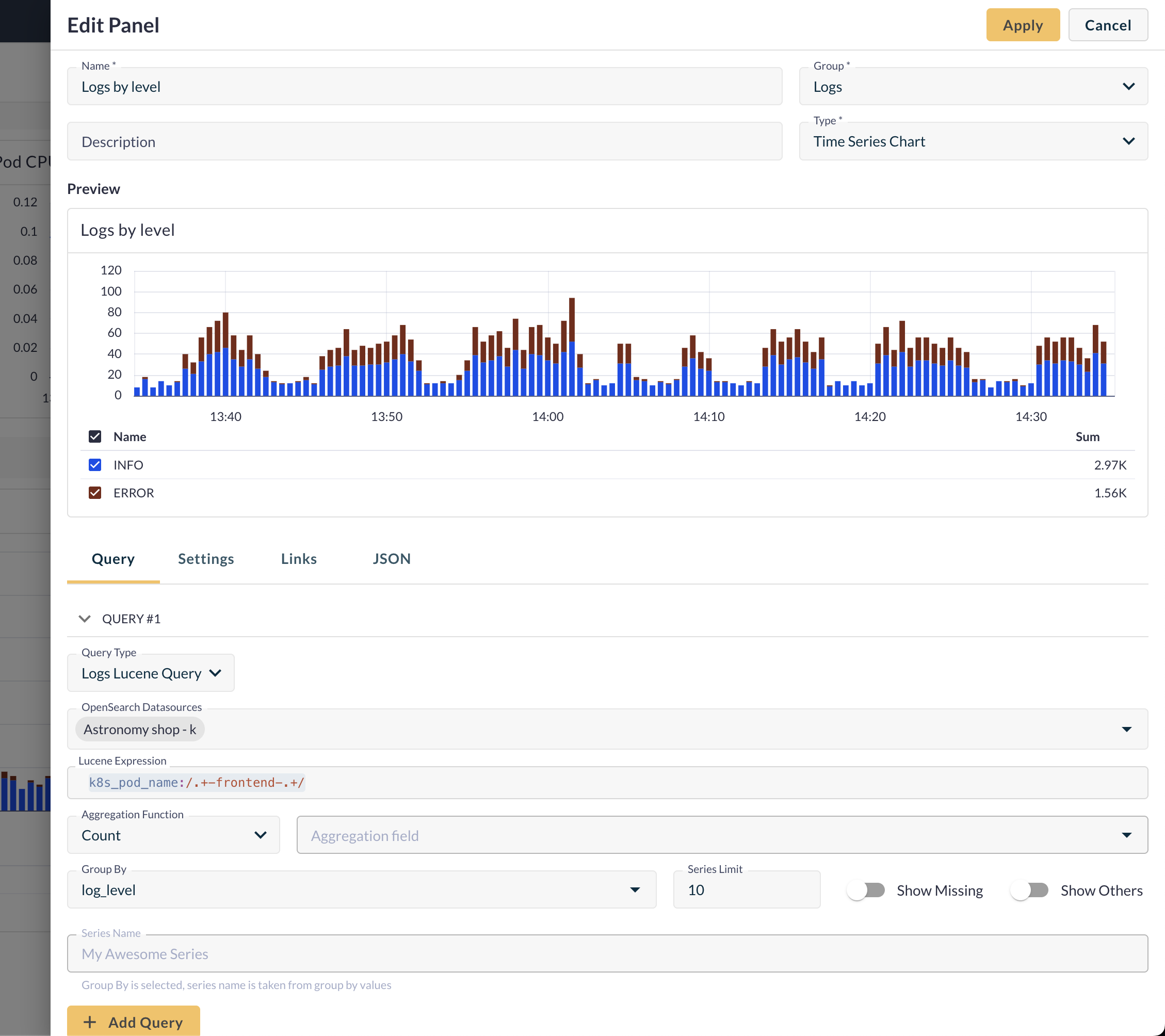
For log-based visualizations, select Logs Lucene Query as the query type. Then, choose the relevant data source (account) that holds the log data you want to visualize.
In the Lucene Expression field, write your query to filter the logs you want to visualize. As you type, the query builder suggests fields, values, and operators to help you build accurate and efficient queries.
For example, to search for logs where the k8s_pod_name field matches a specific pattern using a regular expression, use:
k8s_pod_name:/.+-frontend-.+/
Use the Aggregation Function dropdown to define how the data should be summarized. Common options include:
- Count – Total number of matching log entries
- Avg, Sum, Min, Max – When applied to a numeric field (e.g. response time)
If the function requires a field (e.g. Sum or Avg), enter the relevant field in the Aggregation Field input.
Use the Group By field to group the results by a specific field (e.g. status code, error type). For example, group by log_level to aggregate or categorize logs based on their severity.
You can further refine the data shown in the panel with these options:
- Series Limit - Limits the number of top grouped values shown in the panel. For example, setting the limit to 10 will display only your group's 10 most frequent values.
- Show Others - When enabled, values beyond the Series Limit are grouped into a single "Others" bucket, which helps you visualize the full picture without cluttering the panel.
- Show Missing - Displays a separate category for logs that don’t have a value for the selected group-by field. Useful for spotting missing or inconsistent data.
Use the Series Name field to label your query results in the visualization. This is especially helpful when adding multiple queries to the same panel.
To add additional queries to the same panel, click Add Query. This allows you to compare multiple log slices side-by-side in the same visualization.
When satisfied with the setup, click Add to insert the panel into your dashboard group.
Make sure your Lucene expression matches the selected visualization type.
Variables
Variables are dynamic placeholders that let you customize and filter dashboards without editing individual panel queries. Logz.io dashboards include built-in variables that are automatically available for use. These variables adapt to the dashboard context—like the selected time range or dashboard name—and are useful for building dynamic queries.
In addition, you can define your own variables and use them throughout your dashboard—in queries, labels, legends, or titles. This makes dashboards more flexible and easier to maintain. Instead of manually updating each query, you can change the variable’s value.
For example, instead of hardcoding a specific namespace, you can create a namespace variable and use it in a PromQL query like this:
sum(rate(http_requests_total{namespace="$namespace"}[5m]))
When you select a value like production or staging, the dashboard automatically updates all panels that use that variable.

Create Text type variables
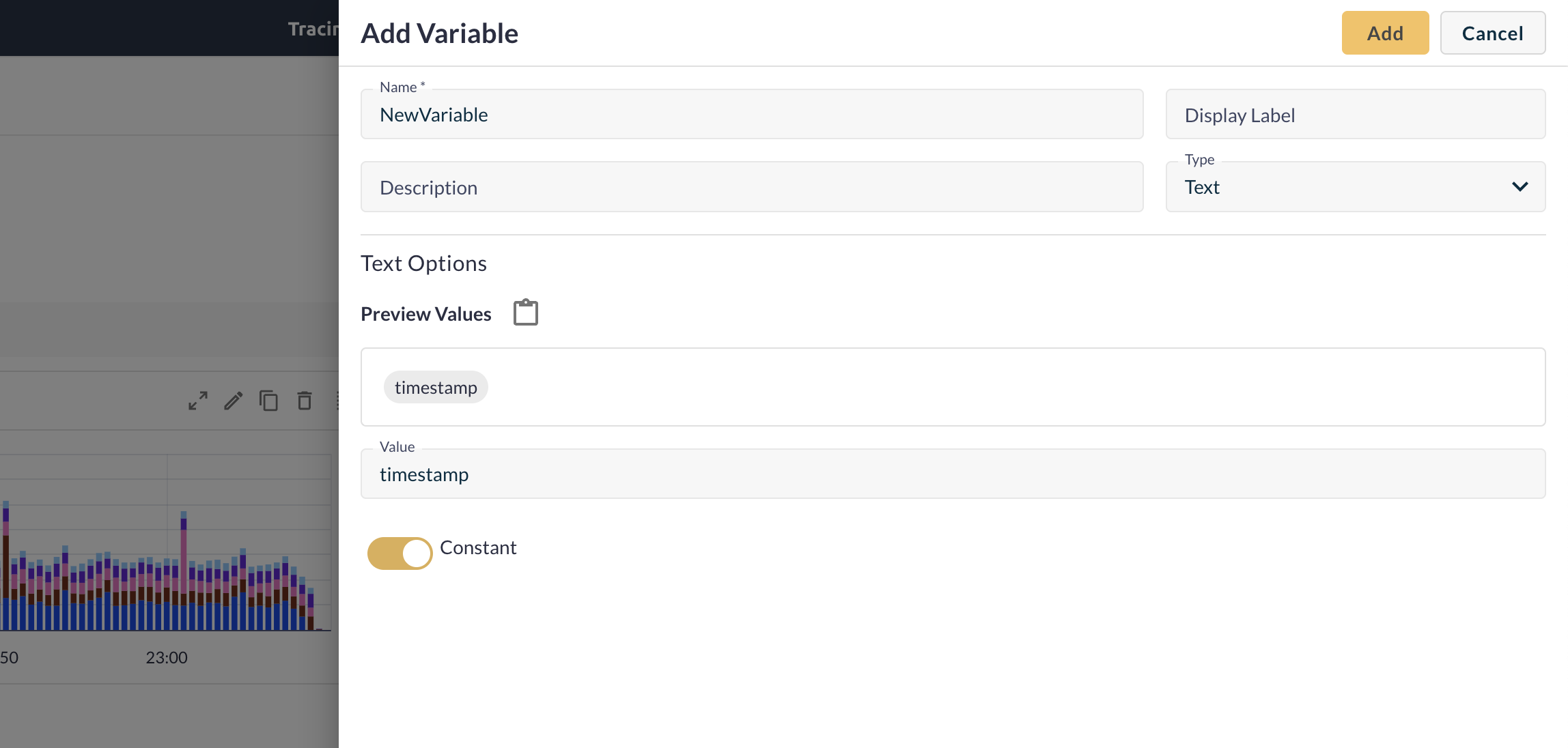
Click Edit > Variables to open the variables menu. Then click Add Variable to create a new one. Fill in the following fields:
- Name – The identifier that references the variable in queries, labels, and panels (e.g.,
$environment). Must contain at least one character. - Display Label (optional) – Appears in the dashboard UI. If left blank, the Name is used as the label.
- Description (optional) – Add context to help users understand the purpose of the variable.
- Type – Choose Text.
- Preview Values – (Optional) View sample values for validation.
- Value – Set the default or initial value for the variable.
- Constant – Toggle this on to make the value fixed and not user-selectable.
Click Add to save the variable and make it available in your dashboard. Use the variable by referencing it with a dollar sign (e.g., $service, $env_id).
Create List type variables
Click Edit > Variables to open the variables menu. Then click Add Variable to create a new one. Fill in the following fields:
- Name – The identifier that references the variable in queries, labels, and panels (e.g.,
$environment). Must contain at least one character. - Display Label (optional) – Appears in the dashboard UI. If left blank, the Name is used as the label.
- Description (optional) – Add context to help users understand the purpose of the variable.
- Type – Select List from the dropdown.
List variables display as dropdown menus in the dashboard. They let users filter panels by selecting from a predefined set of values, which you can reference in queries, legends, titles, and more.
Next, configure the list settings:
- Source – Select where the list values will come from (e.g., static list, label values).
- Values – Type each value and press Enter to add it to the list.
- Capturing Regexp Filter (optional) – Use a regular expression to filter the returned values.
- Sort – Define how to sort the values (e.g., alphabetical, ascending).
- Allow Multiple Values – Enables selection of more than one value at a time.
- Allow All Option – Adds an "All" option that selects every value in the list.
Click Add to save the variable. You can now reference it throughout your dashboard using the $ prefix (e.g., $service, $env_id).

Edit variables
Select a variable from the list and click the pencil icon to edit it. You can modify all fields, including the display label, type, and value.
Note: If you update a variable that's used across panels, dashboards, or queries, it may impact functionality or display incorrect data if not updated consistently.
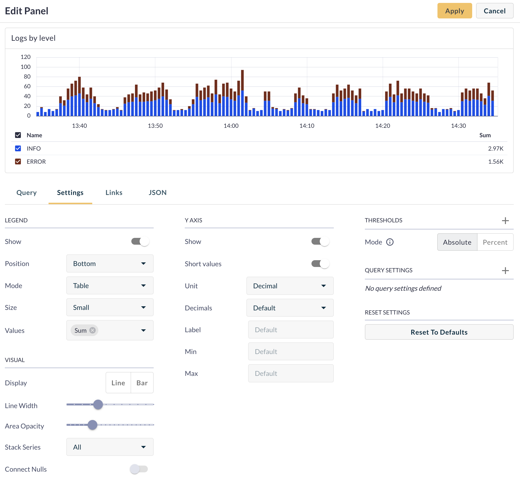
Settings tab
Use the Settings tab to customize the panel’s appearance:
- Legend – Adjust position and display mode.
- Visual Settings – Modify line width, opacity, and other styles.
- Y-Axis – Show/hide values and adjust formatting.
- Thresholds – Define alerting thresholds.
- Query Settings – Change colors and additional parameters as needed.
Adding links
The Links tab allows you to attach external or internal resources to your panel’s header.
Click the + icon and enter a URL. You can add a name or a tooltip to provide added information, and choose whether to open in a new tab or render a variable. Click the + icon again to add multiple links to your panel.
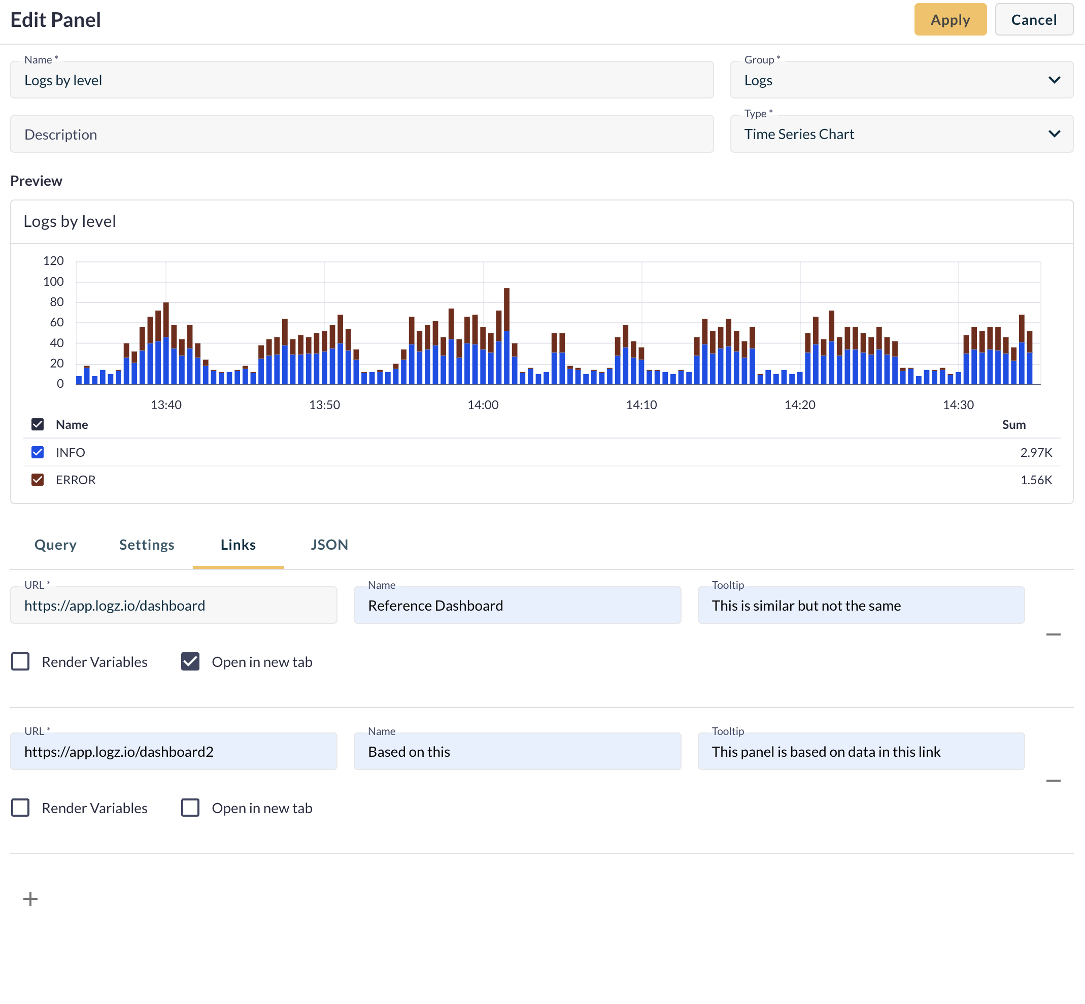
If multiple links are added, they appear as a dropdown when clicking the link icon.
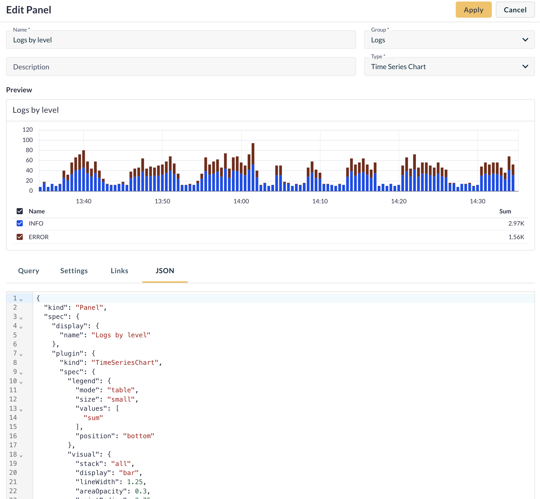
View panel JSON
The JSON tab lets you view the panel’s raw configuration. Use this for:
- Reviewing structure and settings
- Sharing panel setup with teammates
- Troubleshooting queries or data sources
Create a new dashboard from Explore
You can quickly create a new dashboard panel from the Explore view. Once you’ve built a query you want to track, click the ⋮ menu and select Add to Dashboard. From there, choose the target dashboard and panel group, give the panel a name, and click Create to add it. You can also click Preview to open the panel in edit mode directly inside the dashboard.
Once it’s created, you'll be redirected to the dashboard view. You can continue customizing the panel or adding more panels and groups from here. Scroll up to Create a new dashboard for detailed steps on editing, grouping, and building out your dashboard.
View and manage your dashboard
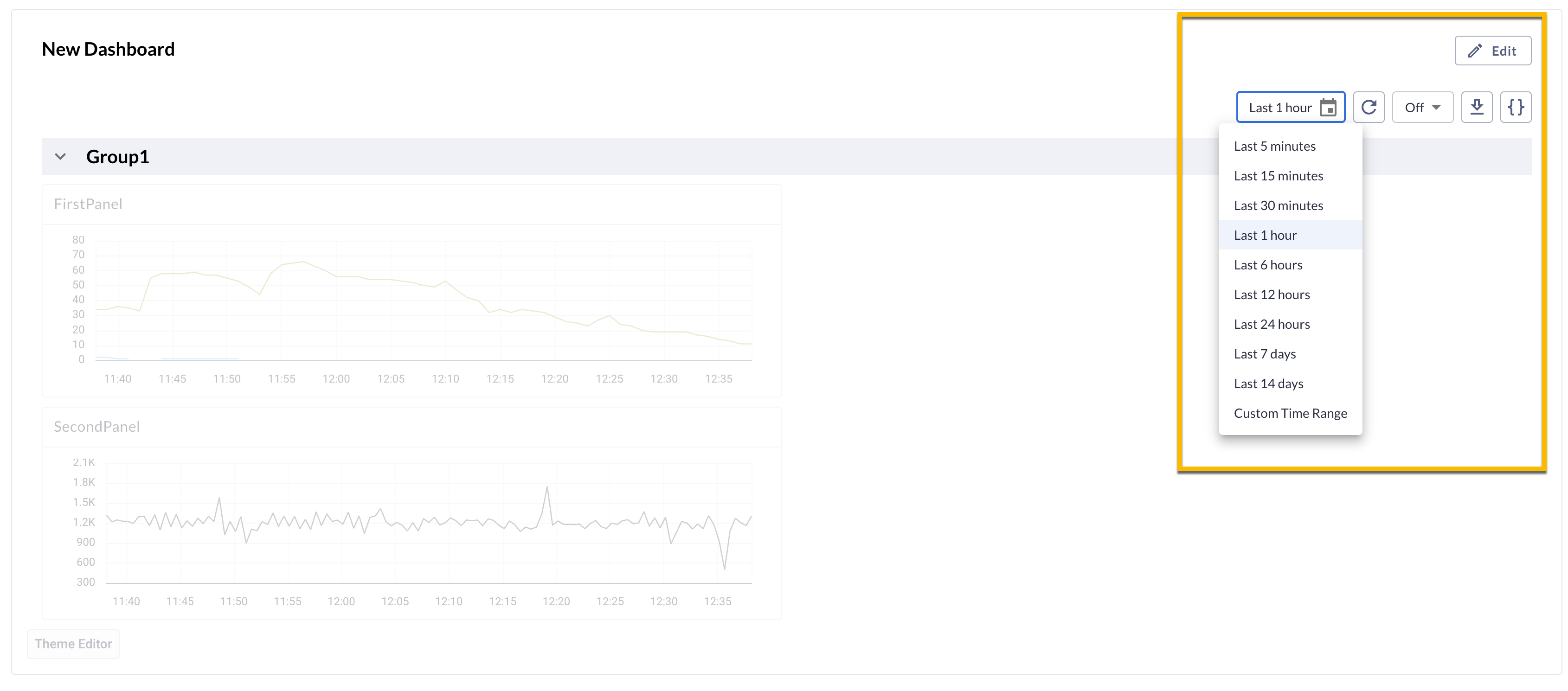
Logz.io Dashboards display data within a selected time range. You can adjust the view using the calendar icon, either by selecting a predefined range or setting a custom time frame. If needed, auto-refresh can be temporarily paused for up to one minute.
To improve organization, panel groups can be collapsed or expanded. Simply click the arrow next to a group’s name to collapse it, hiding its panels while keeping the group accessible. Click it again to expand the view and display all panels in the group.
If you need to export your dashboard, click the download icon to save it as a JSON or YAML file. You can also view the raw JSON configuration directly by clicking the brackets icon {}.
Clicking Edit at the top of the page allows you to modify your dashboard layout. You can add new panel groups or panels, or update existing ones using the pencil icon. Each panel’s data and query settings can be adjusted, and you can toggle full-screen mode for a focused view. To rearrange panel groups, use the arrow icons, and remove them if needed using the trash bin icon.