Services
The Services dashboard centralizes all of your running services, allowing you to quickly detect if and when issues occur. You can use the dashboard to investigate the different services, operations, and logs inside each one.

Prerequisites
To populate data in the Operations and Overview sections of App360, ensure the following metrics and labels are available:
Metrics:
calls_totallatency_sumlatency_count
Labels:
service_nameoperationenv_idstatus_code
Currently, infrastructure and logs are only supported in the Kubernetes 360 environment. For more details, refer to the Kubernetes 360 Prerequisites documentation.
Services overview
You can choose how you want to view your services: a table view or a map view. Switch between the views by clicking on the buttons at the top right corner of the screen.
Table view
The table view contains the following details:
- Name of each service
- Account related to the service
- Impact level - Determines the severity of each event, calculated based on the latency and request rate
- The Environment in which this service is located
- Request rate - Number of requests per second, in numeral and graph view
- Latency - The duration it takes data to travel in the environment, presented in milliseconds and graph view
- Errors ratio - Both percentage and graph view
You can drill down into each service or edit the Anomaly Detector by clicking the three dots at the end of each table row.
The data shown in the table can be adjusted according to your monitoring needs. You can change the time frame based on a list of frequently used time frames, including the last 1 hour, 15 minutes, 6 hours, etc.

You can adjust the data according to your monitoring needs. The filters at the top let you choose the time frame you want to view, compare your view to a previous time frame, and choose which environments, services, and operations you want to display, or clear all filters. If you're looking for a specific service, use the search to see all the matching results.

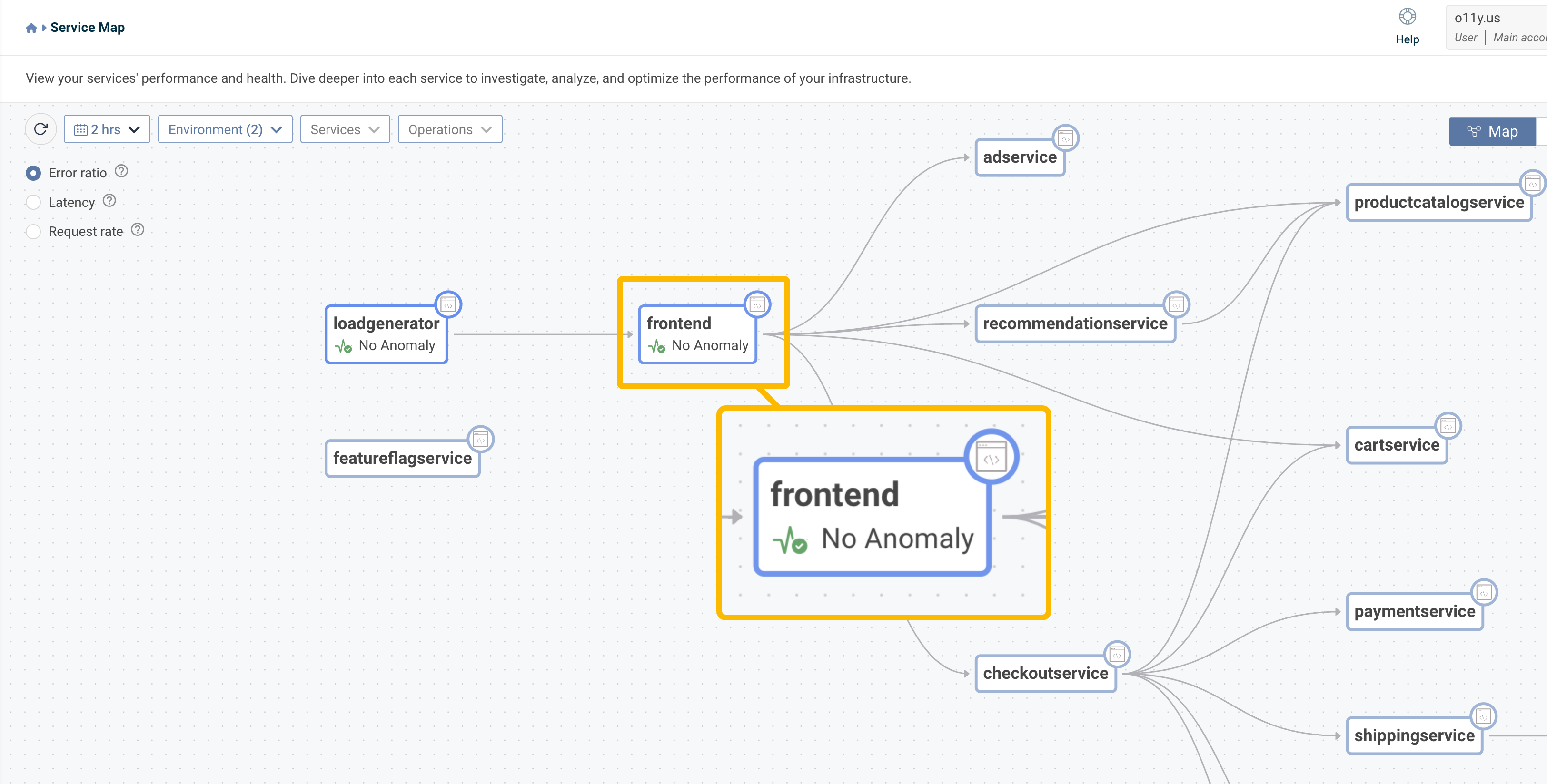
Map view
The map lets you visualize your system architecture, understand the connections between elements, and focus on your services and operations.
The filters change the time frame, service, environment, and operations. You can choose to view the data according to the following:
- Request rate - Number of requests per second, in numeral and graph view
- Latency - The duration it takes data to travel in the environment, presented in milliseconds and graph view
- Error ratio - Both percentage and graph view
You can also zoom in and out of the map, move the elements around, and click on them to get additional info in graph form. Clicking on the button will take you to the service overview screen.

You can adjust the data according to your monitoring needs. The filters at the top let you choose the time frame you want to view, compare your view to a previous time frame, and choose which environments, services, and operations you want to display.
You can drill down or edit the Anomaly Detector by clicking on the relevant service.
Dive deeper into your services
Clicking on one of the services or clicking on drill down opens a dashboard with additional info, including a visual representation of the service’s current request rate, latency, error ratio, and HTTP status code. You can also view a breakdown of the service’s operations, infrastructure, memory, and logs. Each data point is compared to the time frame of your choice, helping you understand the trends and know which area you should focus on.
You can change the time frame and add additional filters, including comparing the data to a previous period or choose an environment, nodes, and pods. Clicking the refresh button will manually update the data.

Hovering over the graphs provides additional info for the time point you've chosen:
- The Request rate graph shows the number of requests made per minute
- The Latency graph provides a milliseconds count of how long it takes for data to travel in your environment
- The Error Ratio graph analyzes the percentage of errors that occurred
- The Status code graph measures the distribution of various HTTP status codes
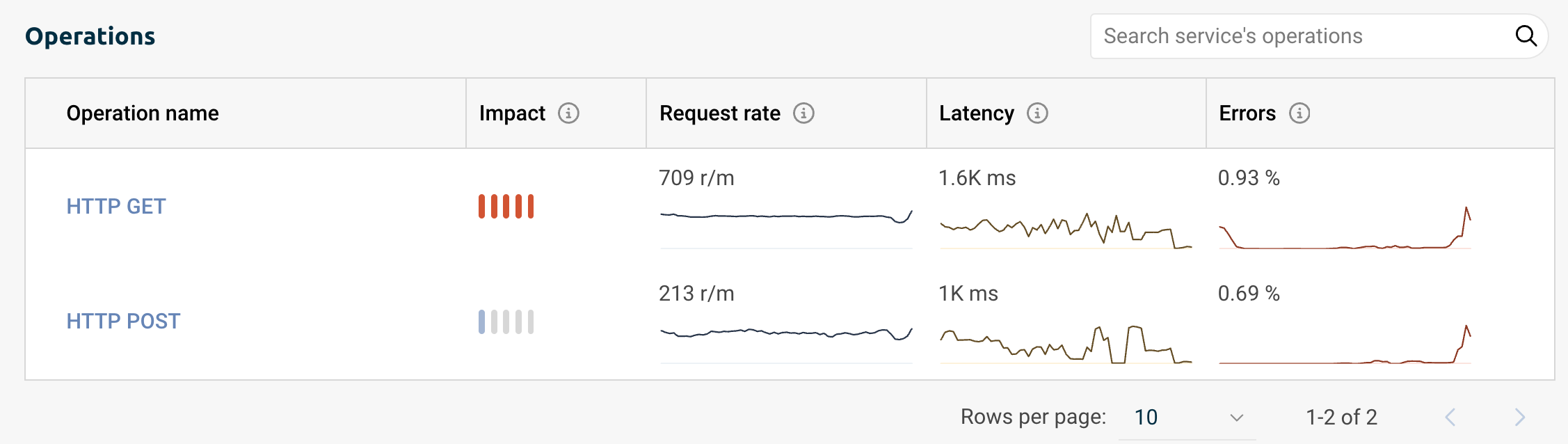
Operations overview
This table includes all of the operations running inside the chosen service with this additional data:
- Operation name
- The operation’s Impact level, calculated based on the latency and request rate
- Request rate - Number of requests per second, in numeral and graph view
- Latency - The duration it takes data to travel in the environment, presented in milliseconds and graph view
- Errors ratio - Both percentage and graph view
Use the search bar to find a specific operation or the arrows at the bottom of the table to navigate the operations.
(Single) Operation overview
Click on an operation's name for a more in-depth view of its current state. You get a graph overview of the operation's request rate, latency, error ratio, and HTTP status code.
You can also view the operation's spans with these additional details:
- Time
- Trace group
- Trace ID
- The Operation related to this span
- Duration
- Status code
Clicking on any span will direct you to its trace view, which will help you pinpoint where failures occur and identify the leading contributors to slow transaction performance.

Trace quickview
Click on one of the Trace Group items to open the Trace quick view. This view includes additional data such as Trace ID, group name, timestamp marking the beginning of a trace being monitored, and the originating service.
You get a detailed view of the operations, including their names and each operation's service, and a visual representation of the time taken to complete a specific operation within a span. Use the search bar to find a specific operation or service.
Collapse or expand spans at this depth by clicking the three dots on the left side of each operation. This can help focus on specific layers or components of your system by reducing visual clutter and making the trace data easier to analyze. You can also click the number to expand or collapse your view.
The link icon next to each operation and service opens the service overview for a deeper dive into the data. Click anywhere else inside the operation to open the quick view menu with additional details, including environment ID, span kind, and more.

Infrastructure overview
View the CPU and memory consumption inside the service. The graphs represent a breakdown of consumption by the hour.
Hovering over the graphs provides values for the specific time point, allowing you to see how much CPU was used by the deployment at this specific time or how much memory this deployment used.

You can toggle your view between the service's environments, nodes, and pods.
Track Deployment Data
You can enrich your Service Overview graphs by indicating recent deployments, helping you determine if a deployment has increased response times for end-users, altered your application's memory/CPU footprint, or introduced any other performance-related changes.
Run the Telemetry Collector on your Kubernetes clusters to enable deployment tracking ability. You can also activate this process manually by installing Logz.io Kubernetes events Helm chart and sending Kubernetes deploy events logs.
Once enabled, navigate to Services and choose one of your running services. A vertical line marks the deployment marker in your graphs.

Clicking on the line allows you to view additional deployment data. This data includes the deployment time, the associated service, environment, and version, and a quick link to view the commit in your logs.
Click View commit to access and view your own code related to this deployment, allowing you to probe deeper into the relevant data.
To activate the View commit button, go to your app or service and add the following annotation to the metadata of each resource's versioning you want to track: logzio/commit_url: "", and the URL structure should be: "https://github.com/<account>/<repository>/commit/<commit-hash>". Learn more.
Detect Anomalies
Logz.io's Anomaly Detector helps you engage a predictive approach towards your data. It monitors your service latency and error ratio to detect any abnormal patterns or data points that deviate from the expected behavior, helping to detect and address issues, improve security, and ensure system reliability.
To get started with the Anomaly Detector, you'll need to set up the anomaly you want to track.
In List view, select the service you wish to monitor, click the three dots, then choose Edit Anomaly Detector. In Map view, click on the operation you want to monitor and select Edit Anomaly Detector.

The Anomaly Detector automatically selects the service, and you can choose to monitor all operations, which will aggregate the anomalies by service, or select up to five specific operations from which to aggregate anomalies.
Next, you can determine the sensitivity of the anomaly detector. Low triggers an alert after finding 3 deviations in the data, Medium triggers when 2 deviations are detected, and High triggers immediately as the first deviation is detected.
Finally, you can choose if and how to receive notifications whenever new anomalies are detected.
Click Save to create the anomaly detector.

Once your anomaly detector is up and running, you'll see an indicator in the list and map view next to each service and operation being monitored.
AI Agent
Click the AI Agent button to activate an AI-powered, chat-based interface that lets you engage in a dynamic conversation with your data. Use one of the pre-configured prompts or type your own question to get real-time insights about your metrics, anomalies, trends, and the overall health of your environment.
